| for Netbramha Studios
Simplifying research for the world’s top minds : Redesigning Nature Index
We set out to transform a complex scientific database into a sleek, intuitive, user-friendly platform that engages researchers and supports informed decision-making.
Client
Springer
Industry
Scientific research & publishing
Span
4.5 months
My role
UX Design, Visual design

Background
Imagine a platform housing some of the world’s most significant scientific collaborations, yet struggling to keep its users engaged. That was the challenge we faced with Nature Index, a comprehensive database of high-quality research output and institutional collaborations.
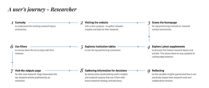
As a UX designer, I had the opportunity to redesign the experience of Nature Index, making it intuitive and engaging for research officers, decision-makers, and senior scientists. It provides institutions with insights into high-quality research output and partnerships.
Project goals
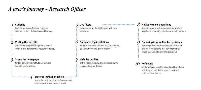
1. The primary goal of Nature Index with this redesign is to establish itself as a hub for research officers.
2. The secondary goal is to increase and enhance the product’s overall usage.
3. The tertiary goal of the project is to generate leads for other products offered by Nature, such as Nature Research Intelligence, Nature Strategy Reports, and Nature Navigator, by targeting those who manage research budgets.
The Problem
Imagine arriving at a platform filled with cutting-edge research, yet you’re unsure where to start. That was the reality for many users visiting Nature Index. Research officers and decision-makers, who came looking for insights, often left within moments—lost in an interface that didn’t guide them effectively.
Even those who stayed struggled to unlock its full potential. Despite its wealth of data, Nature Index didn’t make it easy to explore collaborations or compare institutions. Instead, users were overwhelmed by complex charts and rankings, they couldn’t extract insights they needed to shape research strategies, turning research into a frustrating experience.
Our challenge? To simplify the journey, make insights intuitive, and help decision-makers find what they need—fast.
My role and contributions
We were a team of 3 consisting of myself (UX designer) a Visual designer and a lead designer. I was the core UX resource on this 4 months project and I:
-
conducted discovery workshops with stakeholders and subject matter expert interviews to understand the personas, tasks, and workflows
-
conducted quick competitor analysis and heuristic evaluations to identify opportunities for improvement.
-
designed content model, high fidelity wireframes, prototypes, and visual layouts.
-
collaborated with researchers, data scientists, and the visual design team to bring complex data to life.
Challenges
-
Adapting to an outdated design system while maintaining creativity and functionality.
-
Simplifying vast, complex data into an engaging, digestible format for users.
-
Limited insights into user journeys and behaviours at the start of the project.
Discovery
We began by immersing ourselves in the world of scientific research and Nature Index’s offerings. Two discovery sessions with stakeholders helped us:
Understand the product’s features and its position among competitors.
Empathize with users—research officers, senior researchers, and mid-career scientists.
This phase laid the groundwork for a user-centered design approach, ensuring every decision aligned with the needs of both users and business stakeholders.

Research phase
We didn’t have enough time to perform traditional research methods like interviews and user tests. This was majorly because this project was designer-centred, and encouraged more of heuristic evaluations and internal dogfooding. The Nature team also had website analytics data and they shared major insights based on that as and when needed. From here, to get started, I conducted the following activities:
-
Competitor analysis
-
Heuristic evaluation
These activities gave us a clear picture of the website, user pain points, behavioural patterns, and the key improvements needed to make Nature Index more intuitive and engaging.
Ideating


Designing
After defining the strategy for each screen, we made targeted refinements to Nature’s Elements Design System, ensuring a cleaner, more accessible interface while staying within existing guidelines. I worked closely with the visual designer, contributing not only to the design system but also helping craft the visual elements that brought our concepts to life. We developed interactive prototypes to validate our designs with stakeholders and potential users, iterating based on feedback to ensure clarity and usability.
Some innovations included:
-
Content simplification: One of the biggest challenges was condensing the vast amount of data into digestible chunks. We introduced progressive disclosure, allowing users to access detailed information only when needed.
-
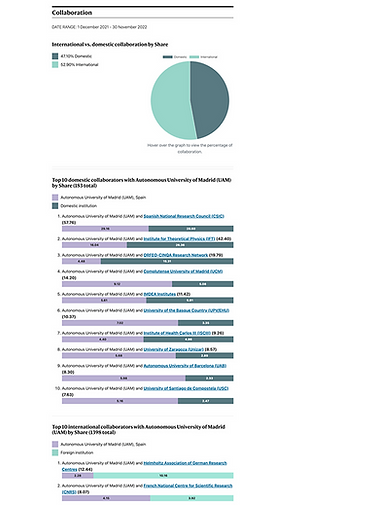
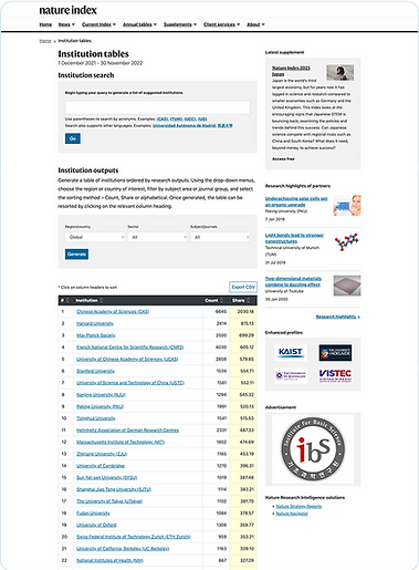
Dynamic data presentation: Revamped how research output and collaborations were visualised, making them easier to explore and comprehend.
-
Global search: A streamlined search experience delivered accurate and relevant results, empowering users to find information effortlessly.
-
Accessibility enhancements: We prioritised inclusivity, improved navigation and readability to cater to a broader audience.

1. Home page
Before

One area we specifically wanted to target improvement was the landing page. The user didn't know what this website is about and what is to be done. The drop off rates were maximum here.
During heuristic evaluation, it was confusing even for me to figure out what ‘Track top papers...’ section was.
Data also validated that, only 26.5% people actually scroll the home page to the bottom.
Something must be wrong with the way the users are perceiving Nature Index and the information they are looking for must be missing.
After
In the new design, I ensured the homepage introduces Nature Index clearly and concisely, presenting information in a way that the user knows what they need to d next. With strong CTAs, users can seamlessly navigate deeper without feeling overwhelmed.

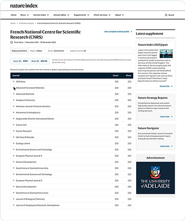
2. Institution profile
Before
This was a key page that users frequently visited, yet they spent less time here than expected given its rich data. The primary reason? It lacked the specific information they were seeking, leading to higher drop-off rates.

After
When redesigning this page, my focus was on structuring the data progressively, ensuring that users could grasp key information without feeling overwhelmed. I integrated intuitive navigation due to the data heaviness of thew page. The goal was to make complex research data easier to explore, analyze, and act upon.

Other screens : because every detail matters
3. Institution lists
Before
After

4. Compare institutions
Before
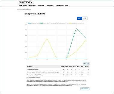
After

5. Outputs page
Before

After
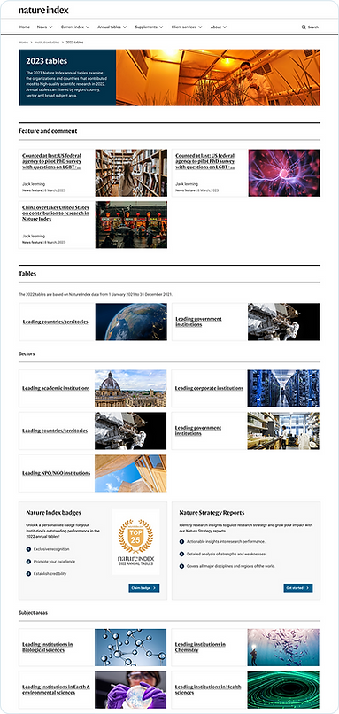
6. Annual tables
Before

After

By the end of the project, we transformed Nature Index into a more engaging, user-friendly platform.
Reflection
This project wasn’t just about redesigning a system—it was about learning about a fascinating domain—scientific research—and creating impactful solutions for its users and creating solutions that truly support their work. It showed me how thoughtful design can simplify complexity, balance business needs with user goals, and turn challenges into opportunities. Most of all, it reinforced the power of collaboration, accessibility, and innovation in shaping impactful experiences.